




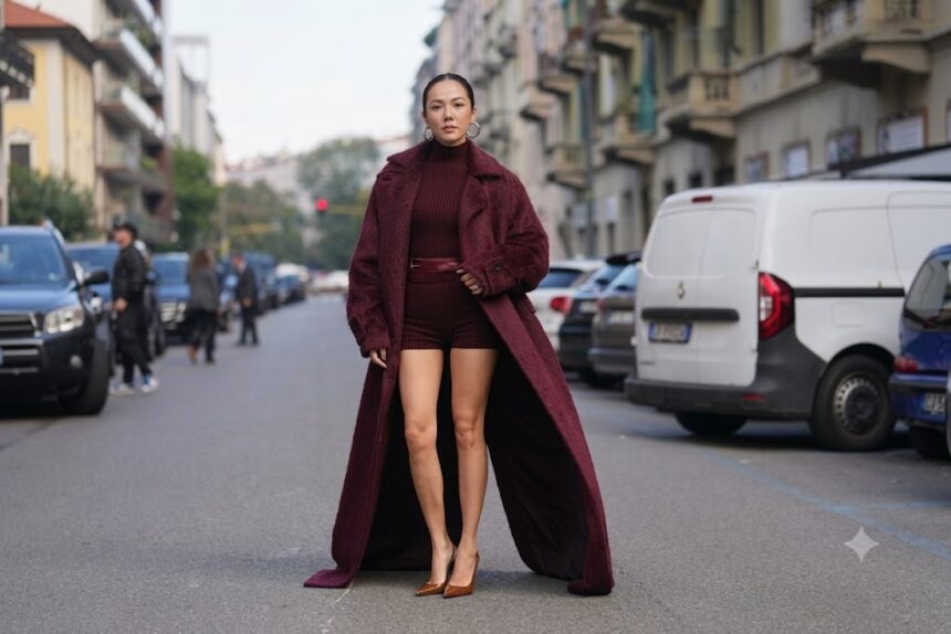
Every autumn, fashion reaches for the same reliable palette: burgundy, chocolate, olive, camel. For roughly three seasons, burgundy in particular has functioned as the default “sophisticated” accent, appearing on everything from leather boots to knitwear until it arguably became more neutral than statement. Fall 2026 has introduced a genuine challenger, and it’s considerably brighter than anything the season’s usual script would suggest.
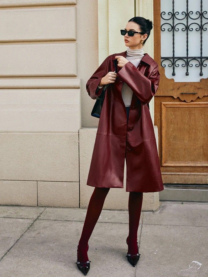
Cherry Red Took Over the Autumn/Winter Runways
The AW26 collections established cherry red as the season’s defining It-hue with unusual consistency across houses, Alaïa, Balenciaga, Chanel, Givenchy, Chloé, Hermès, Valentino, and Miu Miu all interpreted the shade in their own distinct ways, from buttery leather pieces to ghostly layered lace. That breadth matters more than any single brand’s version: when a colour appears across houses with genuinely different design philosophies within the same season, it tends to signal a real shift rather than a coordinated trend cycle. Fashion commentary covering the season frames cherry’s rise explicitly as relief for anyone who has tired of the ubiquitous burgundy trend, a colour enjoying what one publication described as a well-deserved character arc.
What Actually Separates Cherry From Burgundy
The distinction is more than a shade card technicality. Burgundy carries brown undertones, which is exactly what gives it that aged, wine-adjacent, inherently autumnal feel, and why stylists have long treated it as functionally a neutral that pairs with almost anything. Cherry red sits considerably brighter and cleaner on the spectrum, closer to true red than to oxblood, which means it reads as a deliberate statement rather than a background tone. That difference determines how each one behaves in an outfit: burgundy blends, cherry announces itself, and that’s precisely the appeal for anyone whose autumn wardrobe has started to feel tonally identical year over year.
Burgundy Hasn’t Actually Gone Anywhere
It’s worth being accurate here rather than declaring a clean handover. Stylists surveyed about fall 2026’s key colours still name burgundy among the season’s top shades, praising its inherently luxurious quality and noting how well it suits the polished, sophisticated direction fashion is currently taking, particularly in accessories, leather, knits, and outerwear. Interior design has seen the same pattern, with deep burgundy and oxblood tones jumping from 7 percent to 21 percent in one global designer survey year over year. The more honest read isn’t that cherry has displaced burgundy, it’s that cherry has emerged as the season’s genuine statement red while burgundy continues operating as its dependable, neutral counterpart.
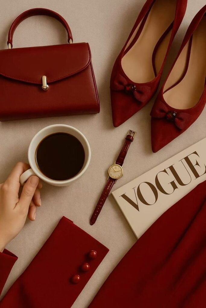
The Most Modern Way to Wear It: Together
The styling approach that current trend coverage keeps returning to is arguably the most interesting part of this shift. Red isn’t being confined to shoes, handbags, and lipstick this season, designers are using it in significantly larger doses, and crucially, they’re layering different reds within a single outfit without matching them precisely. Tomato, cherry, burgundy, mahogany, rust, and pink-red are being worn together deliberately, with the slight clash between them functioning as the point rather than a mistake. Practical pairings that work well: cherry with chocolate, tomato with camel, burgundy with cognac, playing with different depths rather than matching intensities exactly.
What’s Already Coming Next
Here’s the honest caveat for anyone investing heavily in a single shade: the New York Fall 2026 runways have already surfaced cherry’s likely successor. Persimmon, the punchy hue sitting between orange and red, appeared across numerous February collections, including Rachel Scott’s debut at Proenza Schouler, where it punctuated rib-knit dresses, turtlenecks, and satin evening gowns. Trend commentary has already begun positioning persimmon as the shade designed to replace deeper crimsons heading toward warmer months, evidence that colour cycles are moving fast enough now that today’s defining hue often has a named successor before the season it dominates has even finished.
How to Actually Use This
The practical takeaway isn’t to overhaul a wardrobe around one colour. Cherry red works hardest as a genuine accent, a bag, a knit, a pair of boots, or a single statement outerwear piece, precisely because its brightness does the visual work without needing support from an entire coordinated outfit. Paired with the chocolate browns, camels, and navies already dominating fall’s neutral palette, a single cherry piece updates an existing wardrobe considerably more efficiently than a full seasonal replacement ever could, and it’ll still look deliberate long after persimmon has had its turn.